
How to Create a Brand Mood Board That Actually Guides Your Design
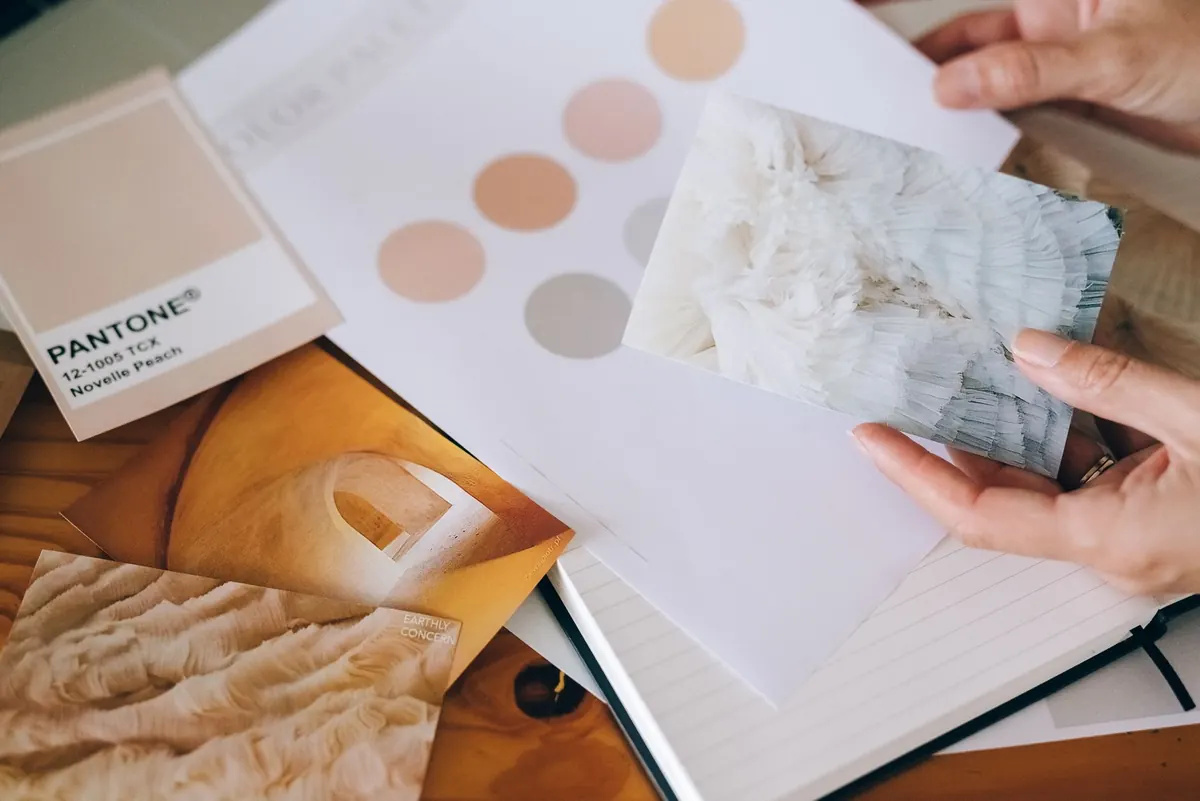
A mood board earns its keep when it ends an argument. It should tell you whether the headline type is too polite, whether the green is the right green, whether that photograph belongs on the packaging or in the bin. A board that only looks nice is decoration. A board that makes decisions is a tool.
The difference comes down to how you gather material and, more importantly, what you write beside it. This process works whether you're building a brand for a ceramics studio, a bike repair shop, or yourself.
Start With Words, Not Images
Before you save a single image, write three sentences about what the brand should feel like. Make them specific enough to argue with. "Warm and approachable" is not a direction. "The feeling of a well-kept hardware store where everything has a place and the staff know exactly where it is" is a direction.
Then write what it must not feel like. Anti-references are as useful as references. If you decide the brand must never look like a luxury skincare label, you'll stop saving marble textures and hairline serif wordmarks without thinking twice. Half the work is elimination.
Last, list the places the design has to survive: a small jar label, a chalkboard sign, a phone screen, a canvas tote. Those constraints shape the board before aesthetics get a vote.
Collect in Four Buckets
Keep color, texture, typography, and reference imagery separate while you're gathering. Mixing them too early makes you fall in love with whole images instead of the specific qualities you actually need.
- Color. Photograph real surfaces — a chipped enamel bowl, a brick wall in shade, a stack of dusty linen — and pull color from your own photographs rather than sampling swatches from someone else's palette. Screen colors shift between devices, so note the values and check them on paper before you commit.
- Texture. Collect scans of paper, fabric, concrete, glaze, wood grain, and printed matter. Shoot them in raking light so the surface reads. Texture is often what separates a flat digital palette from something that feels made by hand.
- Typography. Set your own brand name in every candidate at the sizes you'll actually use. A face that looks elegant at 12pt can fall apart as a two-metre sign. Save specimens of type in the wild too: shop awnings, ticket stubs, old packaging, book spines.
- Reference imagery. Film stills, paintings, product shots, interiors, photographs you took yourself. Collect for composition and light as much as subject — the angle of the shadows may matter more than what's in frame.
Save more than you need. The first pass is about range, not taste.
Cut Until the Board Argues
The cutting is where the real work happens. Run every image through three questions:
- Does this support the sentences I wrote at the start?
- Does it repeat something already on the board?
- Would I still choose it if it weren't currently fashionable?
If two images say the same thing, keep the stronger one. What you want is tension, not noise: everything on the board should be related, but not identical. A palette of five competing accents reads as indecision. An all-sand board with one rust red reads as a decision.
Build It in Layers
Color first, in proportion
Do not present a palette as five equal squares — that lies about how the brand will actually look. Show the dominant color large, the secondary much smaller, and the accent as a sliver. If you plan to work at roughly 60/25/10/5, build the board that way.
Type next, then texture
Place type specimens at the scale they'll appear, with notes on weight and letterspacing. Then bring in texture: a physical swatch taped down, a scanned surface, a close-up photograph. Two or three textures are usually enough.
Imagery last
Your reference photographs should sit inside the world the palette and type have created. If they fight it, either the images are wrong or the palette is. Print the board at A3 and pin it up if you can. Physical boards force a commitment that a scrolling folder never does.
Annotate, or the Board Becomes Decoration
Three people will read the same photograph three different ways. Captions fix that. Keep them short and concrete:
"Matte glaze, never glossy."
"This light — late afternoon, hard shadow."
"Headlines letterspaced wide; body text tight and plain."
"Imperfect edges are intentional."
Write the notes you'd want a new designer to read six months from now, when nobody remembers why the third swatch is there.
Turn the Board Into Rules
A board is reference material. A short set of rules is what you design from. Write both, and keep the rules to a single page:
- Palette roles. Which color is the ground, which carries type, which is reserved for moments that need attention.
- Type scale. One or two families, the weights you'll use, and the sizes for headline, subhead, and body.
- Texture at working scale. Where it appears — packaging, backgrounds, print — and where it must not.
- Photography direction. Light, angle, subject distance, how much empty space to leave.
Test It Against Real Things
Mock up the pieces that matter most before you sign off. A label at actual size. A single social post. A sign viewed from across the street. A form or invoice, if there is one. When something breaks, the fix usually belongs in the rules rather than the individual layout.
Two quick stress tests: convert the board to grayscale and see whether it still has hierarchy, then shrink it to thumbnail size and check whether the character survives. If the whole direction depends on one accent color to be legible, it's fragile.
Keep It Where You Can See It
A useful board keeps changing. Add finished work as it's approved, remove anything you've outgrown, and rewrite captions when your thinking sharpens. After a year it should look less exciting and more obvious — that's the sign it's doing its job.
When a new request arrives and you're unsure whether it fits, you won't have to guess. You'll look at the wall, read the notes, and know.
Photo: Leeloo The First / Pexels